#Oscars So Sappy

Before I refill my popcorn bowl for six hours-plus of Michael Cohen Live! tomorrow in DC, I have to hammer that “Green Book” Best Picture nail, like pretty much everyone else already has.

As a life-long movie fan, and as someone who (he says smugly) believes movies can be art, I assure you with near 100% certainty that 10 years from now “Green Book” will be yet another all-but-forgotten example of Hollywood sentimentality while “Roma” will still be regarded as one of the 50 finest movies of this era. This year, among the Best Picture nominees, based on the marriage of artistic expression and technical craft, on the breadth and depth of human fears, aspirations, motivations and desires — on how life is lived — there was “Roma” and then there was everything else.

Critics and fans who, like me blurted out “Are you [bleeping] kidding me!?” when Julia Roberts announced Best Picture, have had this experience before … many times. (And let’s not forget 1969 when “Oliver!” won and “2001” wasn’t even nominated. Or 1977, when “Rocky” beat out “Network.”) There’s a deep, sappy strain of treacly, middle-brow do-gooderism that has always run through Hollywood.

But I mean, let’s be real, the movie industry is a business based on selling the most tickets it possibly can. Cut the widest path into mass appeal. Art is fine, popular is much better. Hollywood’s self-satisfying liberal neurons get all fired up and excited at the thought of giving the world’s ticket buyers a big, glamorous demonstration of what it believes the world wants to see … in Hollywood’s values.

The rub of course is that the Oscars are handed out by The Motion Picture Academy of ARTS and SCIENCES, which kinda, sorta implies that its big awards show exists to salute and commend the best of the cinematic “art”, as well as the “sciences” that help convey artistic expression to the masses. It shouldn’t matter whether “the best” sold 100 million tickets or 100,000.

But it does.

Before the telecast there was lots of talk about the minefield of screw-ups this year’s glitzy pageant was blundering through. No host! Cratering ratings! How about an Oscar for Best Popular Movie? How about handing out a few of the dull awards during commercial breaks?

Speaking of minefields, in the era of “Oscars So White”, #MeToo and #TimesUp, the Academy’s clear and almost comical determination to inoculate itself against any new charges of racial or gender insensitivity likely contributed to “Green Book’s” disproportionate appeal. I mean, as I watched the parade of remarkably diverse presenters, I had to wonder if guys like Tom Hanks, Matt Damon and Tom Cruise had had their SAG cards pulled.

Distilled to its essence, all those controversies were rooted in the Prime Directive of the Academy Awards — namely: put on a TV show that gets bigly ratings. (As though either the Academy or ABC/Disney would be lining up at a food shelf if the Oscarcast audience slides below 40 million.) The niggling question of whether the nominated movies were truly the year’s most artistic or most technically creative wasn’t really on the radar.

But this is really deep same-old, same-old.

The Oscar telecast has always felt more like a mash-up of Broadway and dinner theater than an event unabashedly devoted to movies. It’s (another) celebrity fashion show, with an orchestra, lots of interruptions for singing and dancing, a couple of snarky jokes and, of course, if we’re lucky, moments of bona fide apex Hollywood. (Bradley Cooper and Lady Gaga. Now that’s what you call “puttin’ on a show”, folks.)

But the show itself — an event supposedly all about commending the best of the year in movie making — is forever incapable of devoting itself top filmmaking. It can’t even bring itself to describe to its massive international audience how movie art is made great, or even “artful”. This year’s show for example devoted easily 10 times as much of its hyper-super valuable airtime to Best Song nominees than examples of the year’s best editing or cinematography.

You tell me which is more core to the essential heart of movie-making.


One Just for Us Kubrick Geeks

As the lights went up for intermission I turned to get a good look at my people. People with whom I clearly share a bona fide kinship. Modern, connected America being all about sub-sets of sub-sets of smaller and tighter cults of like-thinkers, “these people”, I thought, “must be mine.” Who else would tuck into a theater on the hottest afternoon of summer to see a 50 year-old movie most likely for the umpteenth time.

Heading toward the lobby I found myself following a very tall, very large blonde woman. Open-toed pumps with two-inch heels, a light summery white dress with dainty floral patterned trim, a small white hand bag held delicately by the handle and a tight, prim page-boy hair cut.  But tall. And large. Easily 6′ 2″ and, um, not obese, but definitely large-boned.

As I considered going over and asking her how many times she’d seen “2001: A Space Odyssey”, or if this was a first, since it was in town (at the Emagine Willow Creek, now held over a second week) in 90% of its original splendor — 70 mm film, with immaculately preserved color and definition, but not in Cinerama — she turned toward me. And despite the carefully applied lipstick and eye shadow, revealed just the barest hint of a 3 o’clock shadow. That and an Adam’s apple.

A fellow Stanley Kubrick geek, of the prim, put together and seasonally appropriate trans variety. You know, my people.

I’m a little sheepish about saying out loud how many times I’ve seen “2001”. But, what the hell, in theaters alone we’re closing in on 60. That’s um, let’s see … carry the three … roughly 150 hours of my life or nearly an entire week.

While there was once a phase of just going, usually in a moderately-to-highly enhanced state, to be pulled along on “the ultimate trip”, the constant overriding appeal has always been the admiration — the pleasurable sensation — of the film’s beauty, which is directly connected to an appreciation of the craft that made it.. It’s beautiful because it is so well made, and being so beautifully composed makes it beautiful.

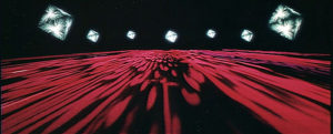
“2001`” was consciously designed as a thing of beauty, with Kubrick describing it in terms of a symphony of cinema. (You can argue a great symphony elicits emotion and intellectual response with the command of only one sense, sound. While film, “2001” in particular, interweaves sound with image and all the photo-chemical balances available to the medium.)

And far from diminishing, the beauty of the movie — its concept, imagination, technical invention and audacity (three and a half years in production with $10.5 million of a publicly-traded studio’s money — $80 million today) — is as vivid as when it was released (to scathing reviews) in 1968. What’s more, “2001” remains today genuinely unparalleled, without valid comparison, certainly by any other mere “sci-fi” movie.

Not that I didn’t watch it — okay, twice last week — and imagine what The Maestro might do with it today if he had a chance to apply digital fixes to the few things beyond his control in the mid-Sixties.

Kubrick’s stated goal was a completely realistic sense of being in space, as best anyone could imagine it years before any human left low-earth orbit. The cliche movie word today is “immersive”, which I assume Kubrick would have accepted, considering his decision to shoot it for projection on gigantic curving Cinerama screens. (RIP Cooper Theater.)

The print being shown at Willow Creek is nearly perfect in terms of original color balance. Beautiful subtleties of color — ambers, ochres and muted yellows — in the African landscape in “The Dawn of Man” sequence are again visible after decades of being lost in washed-out, scratched-up 35 mm prints.

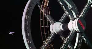
Tiny figures moving about the space station as the PanAm shuttle lines up for docking, and in the moon base Clavius as the bulbous Aries transporter is lowered, like a head on a platter, into the vast underground hangar are now clearly articulated.
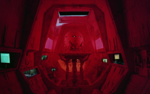
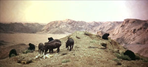
 

Everywhere the nearly pristine quality of the print restores the remarkable depth Kubrick always sought with his use of wide-angle, deep-focus lenses, especially in interior scenes.

As it is, the effect is very close to 3-D, which I strongly suspect would have been an option had the technology been (a lot) better than the cheesy junk it was in 1965-68.

At this point, Kubrick and “2001” are held in pretty much the same regard as Van Gogh and “The Starry Night”. Imitations are rampant but no one would ever consider “touching up” the original canvas itself.

But … if someone, like Christopher “Inception” Nolan or James “Avatar” Cameron were to take on a digital-reconstruction of “2001”, as, you know, a student’s homage to the master, an “unauthorized enhancement” of “2001” as Stanley Kubrick himself very, very likely would have preferred, based on everything we know about what he was going for, it would be a service to cinematic posterity.

For example, Kubrick would certainly be open to color-correcting for the “Dawn of Man” sequences where it is too obvious that the foreground action is taking place on a sound stage. The stage was lit as though in shadow from surrounding rocks, with the Namibian landscapes behind projected through the actors in their ape costumes. There’s a digital fix for that.

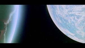
More glaring, in both the opening “Blue Danube” sequence and at the end when the Star Child floats back from his transmogrification, is the indiscernible white-ish blue blob that is meant to be planet Earth.

Actual film footage of the planet at that distance — maybe 20,000 miles out — wasn’t available in the mid-Sixties. But compare Earth as we see it in “2001” to what director Alfonso Cuaron and cinematographer Emmanuel Lubezki did in “Gravity”, with the resource of countless hours of HiDef imagery available to them. Instead of an indistinguishable over-exposed celestial object, “Gravity’s” audience can easily see the shape of specific land masses, the lights of cities and coastlines. Apply the impact of that realism — especially as the Star Child contemplates what to do with his beautiful home and it’s ill-evolved inhabitants — and it’s unimaginable that Kubrick wouldn’t say, “[Bleep] yeah, that’s the shot I want!”

A digital fix could be applied there quite easily.

The biggest fix, certainly in terms of “immersiveness” and realism would be a big up-date in the soundtrack. The print at Willow Creek (supervised by Nolan), booms with the crispness of old, but there’s still only so much separation you can get with the limited digitizing they did off the celluloid film’s sound track.

Somehow there’s a way to toy with that, enhancing for example the threatening growl of the leopard in “The Dawn of Man” sequences, terrifying the man-apes huddled in their dried river bed, by pushing the roar out of speakers in the far reaches of the theater, a la Dolby Atmos. Likewise, “immersiveness” would be well served with more sound separation in the interior scenes, especially in the space vehicles with their subtle symphony of beeps and bleeps and burps.

Other than that, amazingly, there’s very little else the film more “contemporary”.

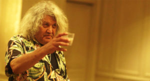
I was entertaining some of this as I returned to my seat after intermission. I lost track of the large, prim, trans blonde. But my attention was drawn to another of my people, a ringer for Jeff Dowd, the inspiration for Jeff Bridges’ “Dude” in “The Big Lebowski”. Maybe 60, wearing a loud Hawaiian shirt with long frazzled hair, the poor guy had obviously lost track of where he had been sitting. Wandering back and forth, finally some friend spotted him and yelled out.

The guy’s head snapped up. He raised a fist.


“Stanley!” he shouted. “The man!.”